
20 Jul Access and Inclusion in Visual and Applied Art exhibitions
Curator event: supporting access to exhibitions for visually impaired people
This event was devised by Craftspace and hosted by the National Centre for Craft & Design
19th June 2017
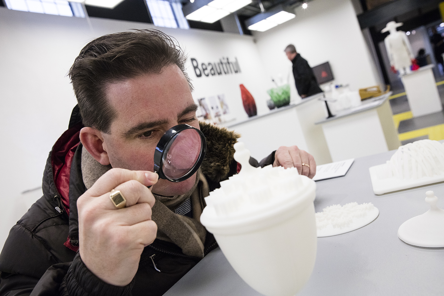
Image courtesy of the National Centre for Craft and Design
Devised by Craftspace and hosted by the National Centre for Craft & Design, this event was an opportunity for exhibition managers and curators to hear about recent projects which support access to exhibitions for visually impaired people.
The event came about through Craftspace’s tour management of Radical Craft: Alternative Ways of Making and Made in the Middle; hearing of but wanting to know more about projects tour venues had undertaken. Following an inclusivity project at the National Centre for Craft and Design, Head of Exhibitions Bryony Windsor, was keen to experiment with the display build of Made in the Middle in response to their findings.
This led to thinking about how we and other curators could benefit from sharing this way of thinking and these findings. An aim of the curation of Craftspace’s recurring exhibition Made in the Middle is to create a network and development opportunities for curators in the Midlands. We were already aware of some inclusivity work but wanted the opportunity to step out of the day to day; discuss new projects, reflect on and find out new ways of thinking and doing things.
For this event we invited Zoe Partington to provide a provocation, then asked staff from Made in the Middle venue, National Centre for Craft and Design, and Radical Craft venue Oriel Davies to talk about projects they have recently undertaken.
Barriers to Inclusion
Zoe Partington is a disabled artist with a radical insight into doing things differently and deconstructing the ‘norm’. She was invited to provide a provocation to highlight barriers to inclusion within venues; including how to consider access holistically rather than in isolation.
Zoe was unable to attend the event so sent a filmed presentation which you can watch below. She talked about the value of experience; how for visually impaired people, it doesn’t have to be the same experience as for sighted visitors but it should have value and be treated with the same importance.
Communication started as a key theme in Zoe’s presentation. She discussed how if venues consult disabled people, they should respect both the time they give and what they say as they will be providing constructive criticism, which could benefit all visitors and help curatorial and venue staff become better communicators in general.
Zoe also touches on funding and how access can be incorporated into funding bids, in addition to action planning and marketing.
Making Visual Arts Venues Accessible
Bryony Windsor, Head of Exhibitions at National Centre for Craft and Design (NCCD) and Professor Anne Chick from the University of Lincoln were invited to share the findings from their ongoing research which explores how visual arts venues can be more accessible to visitors who are blind or partially sighted.
Bryony and Anne presented their findings in an ‘in conversation’ format. Their Powerpoint presentation can be downloaded here.
The partnership came about when NCCD were considering hiring a 3D printing touring exhibition. Bryony approached the University of Lincoln to ask about printing some exhibits from the touring organisation but the University saw the opportunity to be more ambitious and suggested a new approach. The collaboration began through a discussion around opportunities to explore 3D printing further than simply printing objects for exhibiting. During conversation Anne was struck that over 68% of NCCD’s visitors are over 65; this led to thinking about the ageing population and issues that come with that, such as sight and hearing loss. This sparked interest for Bryony and Anne to undertake a research project to explore these issues through a user centred/co-design approach to the presentation of visual art. The project developed into one about intellectual access, rather than just physical, which was inclusive for all; focussing on exhibition design, curation and curated assistance for visitors to the exhibition. The exhibition became 3D Printing: The Good, The Bad and The Beautiful which was on show at NCCD from 28 January – 23 April 2017.
Throughout the exhibition development, Bryony and Anne worked with Zoe Partington and a focus group identified through the Royal National Institute of Blind People (RNIB) in Sleaford. Within the group they had a range of ages, but everyone had an interest and experience of galleries and/or visual arts. They recommended this as it means you’re all at a certain level of understanding which led to frank and open discussions. They followed up with this group once the exhibition had opened to get feedback from them and make changes where possible. Zoe provided training for the gallery staff which was paramount to the success of the visitor experience when the exhibition opened.
The exhibition space was presented as a Creative Laboratory, with multi-sensory access. Bryony and Anne worked with the exhibition design team at the University of Lincoln and NCCD’s regular freelance design and technical teams which has been beneficial following The Good, The Bad and The Beautiful as the designers are already aware of the venue’s inclusivity practice. The exhibition, designed by Arnaud Dechelle was devised for blind & partially sighted people, so they weren’t the ‘other’, everything else was secondary.
There was a decision not to allow all exhibits to be touched as it would have been creating an ideal that wouldn’t be possible to continue; not all art works can be touched and it is important that this is recognised. All exhibits did have a touchable item to accompany them and these ranged from textured and weighted to perfumed and consumable! There was tactile flooring to guide visitors between plinths and around the exhibition. Raised listen and touch symbols were included where appropriate. Magnifiers were also provided.
The inclusive nature of the research drew attention from the media and NCCD had more coverage than with previous exhibitions. Particularly important was the radio coverage that NCCD had for the exhibition as that reached a more diverse audience by not being limited to a visual format and directly spoke to their target audience. The audience also grew with a daily average of 163 people. Staff at NCCD had continued dialogue with visitors throughout the exhibition and offered guided tours for visitors with a visual impairment.
The R&D was mainly undertaken by Bryony and Anne within their regular roles at NCCD & the University of Lincoln and they found that it didn’t require an enormous amount of additional resource once they had learnt the basics; so would encourage others to do that same. Additional funding was secured from Arts Council England for the exhibition and Big Lottery’s Disability Research on Independent Living and Learning (DRILL) programme.
Key points of learning:
- Colour contrasts: tops of plinths and desks were painted a different colour to the sides to indicate height. Plinths must stand out from the walls and floor colour.
- Interpretation panels were in contrasting colours, text and background, or had a hairline border around the edge to differentiate them from the wall
- Font: you can experiment with interesting fonts as long as you have space around each letter, don’t italicise, don’t use all capitals ½ line spacing, 16pt smallest font size
- Have space around the panels when they are installed, so people can get up close, have an option for panels/labels so people with visual impairments can hold them close to their face
- Plinths have curved edges
- Plinths have plenty of space around the object; between it and the edge in case people lean
- Use matte Perspex to limit reflection
- Audio descriptors are good at engaging with everyone but as we used trim phones we added labels to indicate that people could pick them up
- Keep all touchable items, audio phones etc in the same layout at each station so that a pattern emerges when someone feels that table top for items
- Having telephones for audio descriptions weren’t always the best solution as some people wanted to be able to listen with their guide or companions
- People liked hearing the artist speak about their work in audio descriptors as well as having a description of the physical object
- Work with artists so items/display can be accessible – include in contracts
- Pivot object labels where possible, so they are at 45°, as this is easier for many people to read, or if possible have labels on Velcro so they can be removed by visitors who need to hold them close to their face to read them
- If there are small exhibits that visitors can’t get close to you could provide large photos, if there are large exhibits that can’t be touched, perhaps these could be recreated in an affordable way so they can be touched
- There were pros and cons with the flooring: it was good contrast for visually impaired people and provided a pathway for other visitors around the exhibition, however, it was difficult for wheelchair users, visitors with pushchairs, heels and an issue for people with autism as contrasting colours create difficulty with depth perception
Introducing Audio Description
Alex Boyd Jones, Curator at Oriel Davies Gallery in Newtown, Wales was invited to present on a recent audio description project they had undertaken for a touring exhibition. Download Alex’s presentation here.
At Oriel Davies all print and interpretation is bi-lingual (accept for touring shows hired in). The Gallery now only has a gallery guide on Saturdays. They became aware that audio description represented a gap in their provision.
Flora was a touring exhibition devised by Oriel Davies was going to tour for 18 months and included two residencies. Part of the funding criteria for the exhibition included a focus on disabled audiences. The length of the tour gave them time to experiment with audio description, to allow proper time, this was focused on the final tour venue Aberystwyth Arts Centre.
To begin with, staff at Oriel Davies contacted DASH (Disability Arts Shropshire); the first step was training, (provided by Zoe Partington) for staff at both venues. The training was over two days and worked well to embed the resulting thinking in each organisation. The focus of the training was on blind and partially sighted people in the visual arts. Alex has provided detailed notes to accompany her Powerpoint; the training they received is outlined in those, in addition to the details of her presentation.
Key points:
- Clarity – it is important not to over describe
- Language – not representing the visual e.g.: ‘we can see’ becomes ‘there is’
- The audio files included a description of the work, followed by a biography of the artist and lasted for 2-4 minutes
- Issues with the use of maps for audio description, particularly for touring exhibitions or temporary shows where you are unlikely to know the layout early on – magnetic badges on walls can target this
- Visually impaired people do use this technology in domestic settings
- The project was a starting point
- Audio marketing can be used through social media
- Important to describe the space too to give a whole context: is it big/small, light/dark.
No Comments